The app that helps mothers make an important decision
By Marek van der Hoeven on march 3, 2021
Last year a client wanted to develop an app that focuses on getting soon-to-be mothers vaccinated for whooping cough (which would also protect their baby when it is born). It was an interesting and educational process that encompassed most steps of a user-centred design approach and in my opinion very suitable for a case study. It's a challenging case since vaccination can be an opinionated topic. I will discuss the approach, the challenges I faced (and tried to solve) and show some mockups and designs as the final product.
Stage 1: Empathize & Define
The client wanted to help and support pregnant women by offering information and guidance about a vaccine that prevents a soon-to-be-born baby from getting the whooping cough illness through a vaccine given to the mother. It’s important to define the user’s needs and problems and see how the mother could get help from this new app. The client had already done a focus group session, consisting of pregnant women, to gather (design) information and ideas about what the app should look like and try to do. From these sessions some of the following challenges arouse:
Carefully inform the pregnant mother about the vaccine & the sickness it prevents for their baby. It should be easy to understand for anyone.
1. Let the mother reflect on the vaccine benefits and risks.
2. Important: the app shouldn’t nudge a mother into a certain decision.
3. The app should be accessible to all demographics (high/low educated pregnant women)
Stakeholder Interviews & Card Sorting
All relevant stakeholders (midwives, the client itself, e.g.) were invited to discuss the application and hear about their ideas and needs to tackle the challenges listed above. What will the content look like? How do you think we can inform (and not persuade) the pregnant mothers about their decision to get vaccinated? What should we include in the app or what should we definitely not include? This was also the perfect time to set up a card sorting session afterwards; to get a solid grip of the information architecture and its content. From this card sorting session, a sitemap for the application was made.
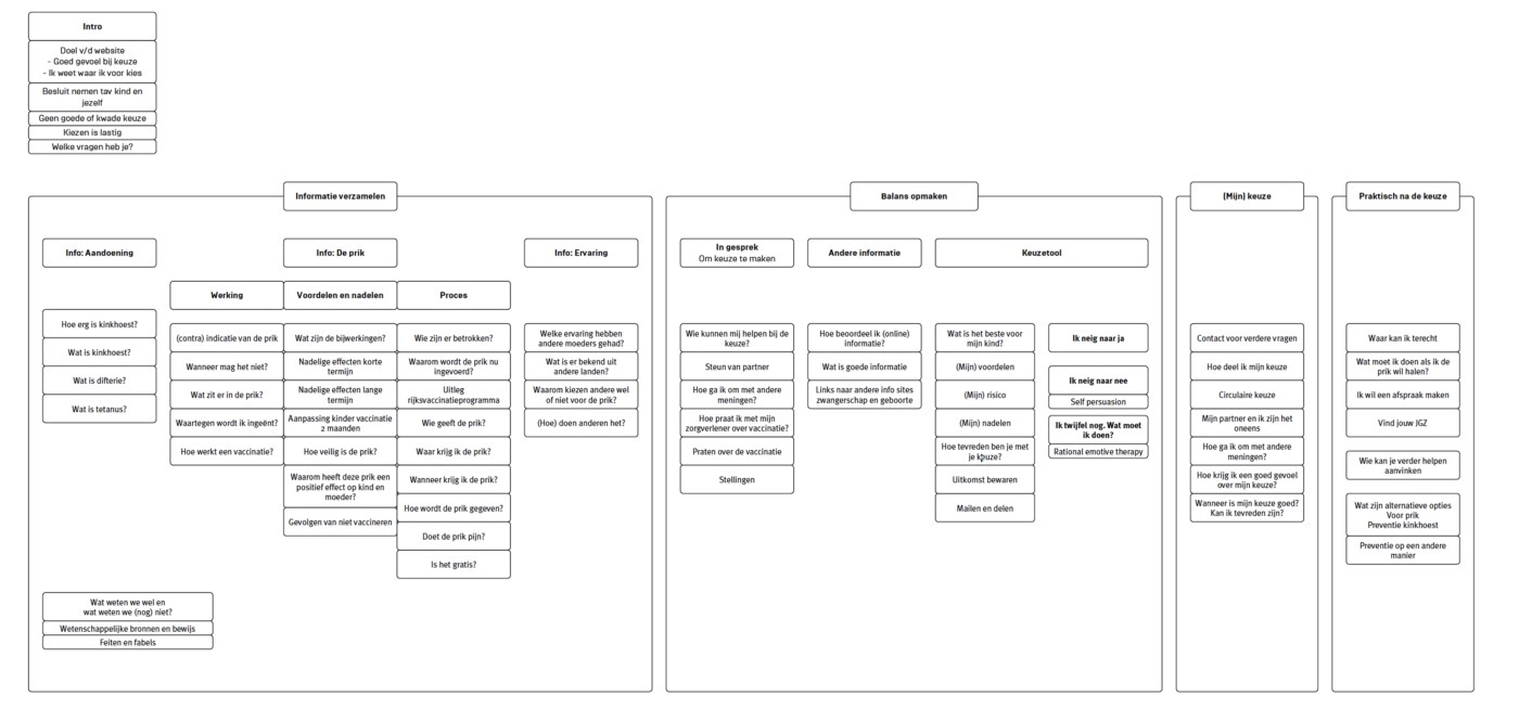
The brainstormed sitemap (it's in Dutch)
A few ideas came out of this session and are also processed in the sitemap. The main purpose of the app is to inform the user in a neutral & supporting way. During the session we defined four use-cases, which a pregnant mother could get help with via the application:
1. Learning centre
The soon-to-be mother would need a place to learn everything about the vaccine, the sickness it is for, the risks, the benefits and any questions she could have, should be answered here. Also, the sources of information should be included here, to showcase where the information is from and show that the information can be trusted. We decided to call this part of the app the learning centre.
2. Considering the decision made
To also support the soon-to-be mother in her decision and give her confidence about her choice, we added a section where this is addressed. This part should cover any doubt the mother has. For example, she could be afraid of the vaccine and has not yet decided to get it. A tool in this section (consisting of certain questions) would give an answer to what she is leaning to (yes/no) with links at the end to the learning centre, which provide information about her doubts we uncovered with this tool.
3. Decision made
This section covers some basic help and information if the mother has made her decision. For example, the app offers help when her partner does not agree about the decision and the app gives tips and an exercise to talk to the partner via generated questions. This section is meant to support the mother in being confident and standing behind her choice.
4. Practical information
The last section shows some practical information about getting a vaccine. This information can, for example, be the nearest vaccine location or shows the steps to make an appointment online.
Stage 2: Prototype
With the help of the sitemap and the different sections, I could now set up a first simple prototype to test some of the ideas we had for the app. We used this prototype for the first usability session with 6 pregnant women and we wanted to see how women would react to some of the ideas we’ve had so far. A prototype (or elaborated wireframes) was made with the help of Figma and consisted of 4 sections based on the findings mentioned earlier: Intro, Learning centre, My decision, Appointment. The prototype can be partly viewed below.
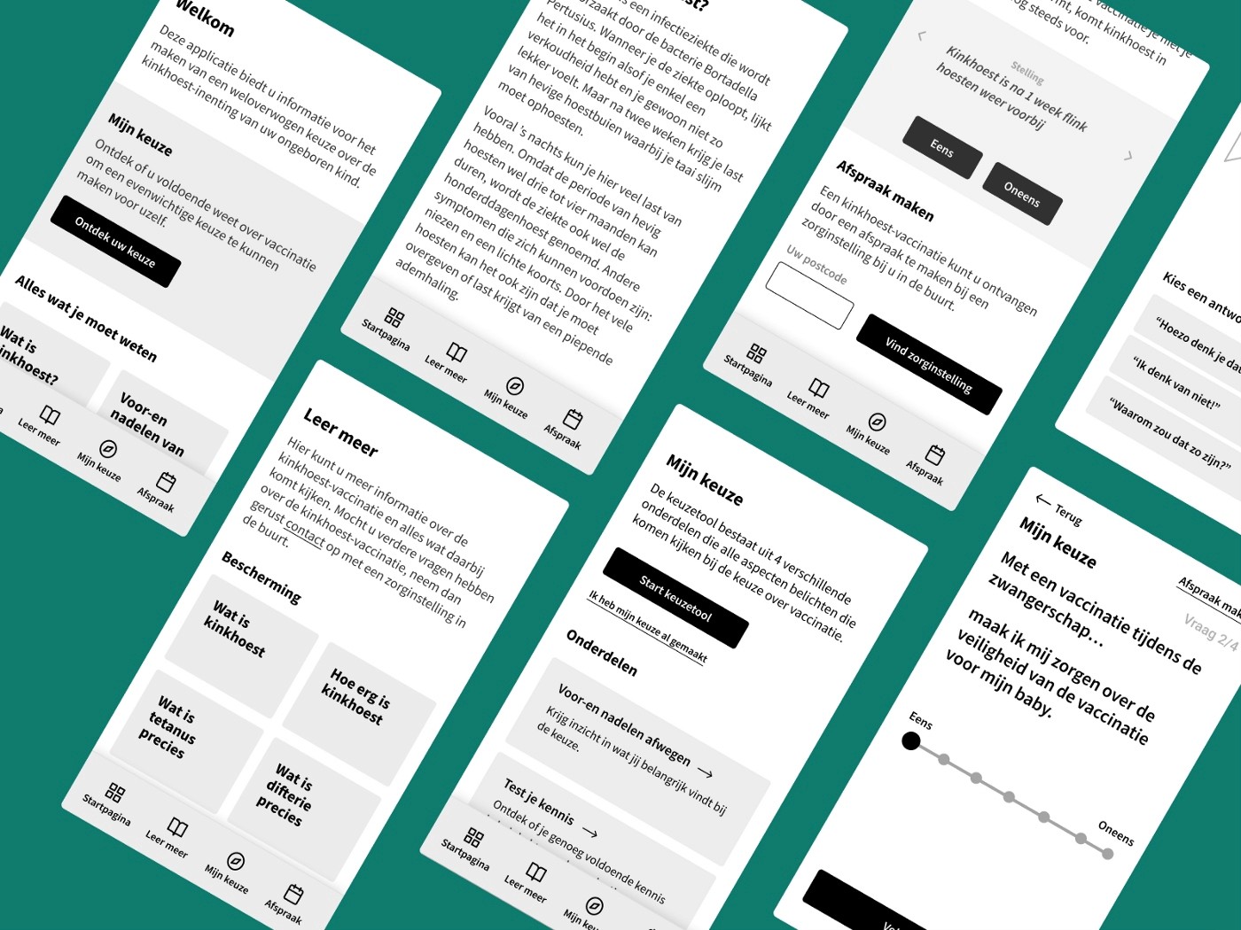
The prototype, focusing on content and navigational structure
For the first usability test, we wanted to focus on testing the navigation flow, seeing how users would react to such an app in general and of course, find any unexpected effects/discoveries. Besides mostly positive feedback about the first prototype, some issues followed. The following main issues were discovered:
1. Getting the correct information from the text was sometimes difficult. Adding subheadings or summaries to certain info pages could be a solution
2. Some text was written with too much medical jargon and hard to understand or off-putting.
3. The tool that helped the user understand their choice was sometimes too complex. Some of the questions asked consisted of double negatives and were therefore rewritten.
4. The application had some practical information, but the users missed some basic info like giving the route to a vaccination location or showing a phone number to call for any unanswered questions.
These issues were resolved before the designer started working on the application. We found that most of our ideas for the app could be validated during this usability test and the feedback given from the participants showed that we were heading in the right direction. No pregnant mother thought that the app was nudging or deceiving them. There was enough information and no one missed something specific, although some text should be rewritten into more layman's terms. The mothers really liked the tool and found it helpful for their decision process.
Stage 3: Design & Summary
The design made (not by me) was based on the prototype and is currently in development. After the development, we are going to do more usability testing to see where we can improve again. Some designs can be seen below and are loosely based on the preferences of the research done during the testing (colour preferences, images, etc.). You can find a couple of these designs below:
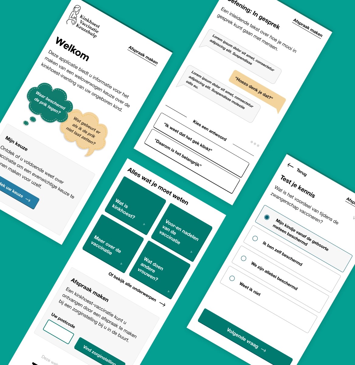
First iterations based on the prototype
This case shows how we went from an idea to an app in a design centred approach. One area I would like to improve is UX writing. This is often overlooked during the design/development process and this case study showed the importance of clear and concise copy. All in all the process was challenging but worthwhile and hopefully the app will launch soon in the app stores.
Marek van der Hoeven
© 2022